Urban living can be a bit of a trade-off (or, depending on how you look at it, a big trade-off). Whereas the suburbs are commonly known for larger homes and properties at a lower price, urban dwellings offer the convenience, community, and flair of a downtown address.
Many will gladly sacrifice one for the other, but I’m here to tell you that you can have your cake and eat it too. From an interior design perspective, there are ways to make a small room look bigger; as they say, perception is everything. Here are tips to achieve an artful compromise, without sacrifice, and live large in your small home.
Maximize the Light and View
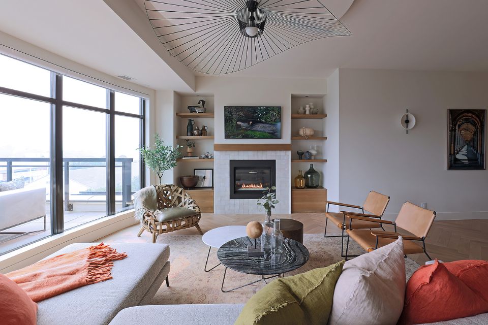
It’s amazing what a few windows can do, and thankfully for downtown dwellers, many newer city condos feature window walls and open-concept floor plans that make the most of their two best features: the light and the views. This urban condo that my team recently designed features wide expanses of glass and breathtaking views that became an instant focal point for us.
In small spaces like this one, a great view can help draw the eye out toward the horizon to create the illusion of more space within the suite and make a small room look bigger. We made the view one of our key focal points by positioning the living room area, so it faces the windows and leaves unobstructed views across the entire suite. You can literally sit and enjoy the view from any point within this main living room area.
The second “maximizing” element we’ll touch on is light. Natural light is a small room’s best friend, making the small room look bigger and brighter. If privacy isn’t a concern, consider leaving windows uncovered to make the most of the daylight. If you want to shut out the world when the sun goes down, get some window treatments, retractable blinds, or streamlined blackout curtains that can be pulled out of sight by day, or drawn on demand at night.
If natural light is hard to come by in your space, ensure you have ample and evenly distributed ambient lighting. Ambient light is the “general” lighting in the room and is meant to mimic daylight. If your room lacks windows, consider adding:
- Extra pot lights
- Ceiling-mounted fixtures
- Table or floor lamps
- Accent lighting
- Mirrors and other reflective elements
Play with Color
To help amplify the effects of natural light, use bright, neutral, and light colors to make a small room look bigger, which are more reflective than their darker, deeper color counterparts. Use light colors on everything that occupies a big visual snapshot in your living room—for example, your wall paint colors, rugs, and large-scale furniture such as a sectional.
Streamline with Built-ins
Furniture typically occupies precious floor space and having too many furnishings—even if you consider them “essential”—can quickly make a room feel a lot smaller. Given the option, I always recommend built-ins for small spaces for two reasons.
First, built-ins often come in the form of bookcases, cabinets, and shelves, which are great storage systems that can be concealed behind doors or panels, if desired. They are also a great way to display collections and select items.
Secondly, because these “furnishings” are integrated into the plans of the home, as opposed to add-ons, they become part of the home, blending in and even disappearing entirely. In my professional experience, these design features are usually highly coveted items, and if they’re not included in the interior design, they are often included later in the quest for a “dream home.”
TIP: I personally love using built-in shelving to help highlight a focal point within a space. This type of framing helps attract the eye in a subtle, grounded way, but also amplifies the feature and makes it feel that much grander. For example, this fireplace is flanked by built-in open bookcases, painted white to become part of the millwork. Then, adding function to aesthetics, the homeowner uses these areas to store and display family photos, art, and collections. The secret to styling success is keeping your display simple and selective!
Embrace the Negative Space

In interior design, the negative space in a room is just as important as the elements that fill the space. Negative space is blank space—those empty corners and bare walls that give your eyes a chance to breathe. Negative space also allows for more room so residents and guests can physically maneuver around furnishings and people and through traffic paths.
Because most downtown dwellers are likely limited in square footage, the best way to achieve negative space and free up more of that valuable breathing room is by editing down your furnishings and unwanted items.
If you’re working with an existing space (and stuff), evaluate each item and only keep the things that you really love and use. This really comes down prioritization of your belongings and to free and clear living, with a minimal interior to match. Put simply, less stuff means more space, which can make your small room look bigger.
To get there, limit your furniture to essential items and multifunctional pieces; by multifunctional, I mean ensure you factor aesthetics into your decisions. Choose leggy furniture that you can see under or through, such as a sofa with feet and chairs with slim legs. Also consider glass and chrome furniture and accessories that don’t block light or obstruct views.

But you may be asking, how do you add negative space without leaving the room looking unfinished? As an interior design professional, I abide by purposeful design. This is how I approach every project, and not only in terms of the items I choose to add; I also consider the spaces left empty.
Look at traffic patterns and consider how you use each space. Then furnish and accessorize only as needed. Periodically stand back and evaluate your composition to ensure you’re achieving a nice balance. Don’t overdo it. Remember: less is more.
The secret to great interior design is to balance what you want with what you really need. When it comes to compact urban homes, whether we’re talking condos, townhomes, or houses, they can all pack a big punch within their limited floor plan.
In fact, if you’re looking for character and charm, an urban home could be the way to go, often telling a story at every turn. At the same time, urban homes can certainly pose some challenges, such as smaller rooms and less light. But, as they say, good things really do come in small packages.
With a purposeful interior design plan, and perhaps an experienced, professional designer guiding you through the home renovation dust, you too can make your small room look bigger and maximize that motto!It may just take some thought and planning to uncover those hidden treasures.
Looking for more design inspiration? Check out our latest issue of Beautiful Design Made Simple for more exclusive designer tips and insider knowledge on the top trending floors.
Design by TRISHA ISABEY Photography by TREVOR COOPER
Trisha Isabey is the Creative Director and Principal Designer for award-winning Isabey Interiors. The Kelowna-based design firm has excelled for over a decade creating thoughtfully curated designs. The sought-after design team offers a diverse range of design services throughout Western Canada and nationally.


